Retention Insights
Retention Insights provides more detailed info about lost subscription trends and why there are being lost whether active, passive or expiry churn. It provides you actionable strategic information of how to decrease your most prevalent churn.
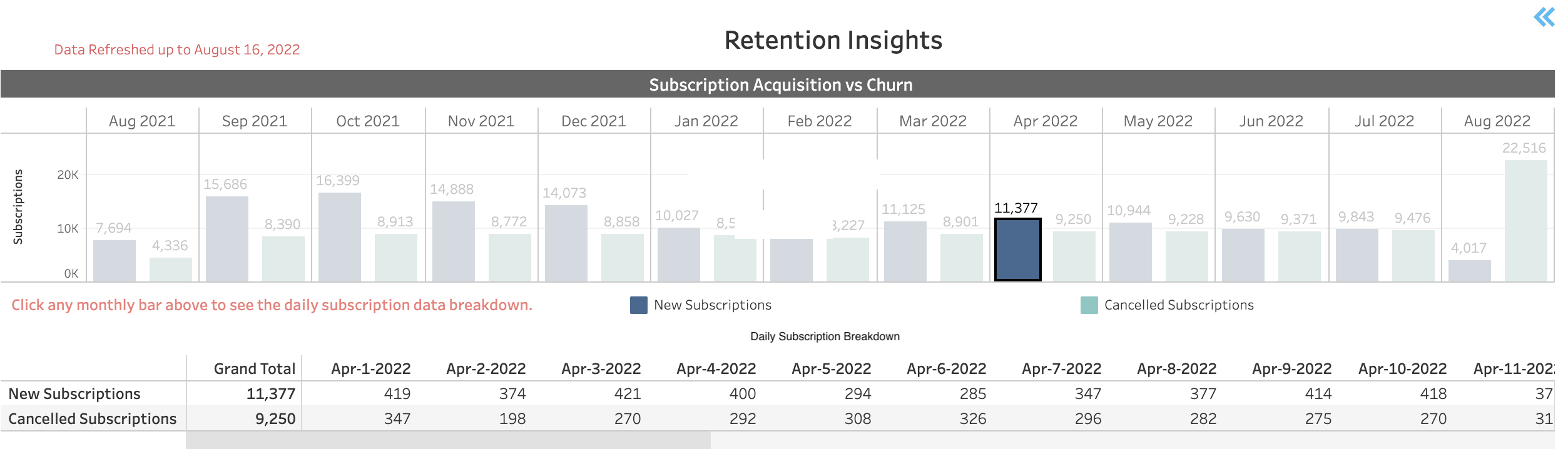
- Subscription Acquisition vs. Subscription Loss (Churn) - This column chart provides a
comparison of new subscription acquisition (sign-ups) vs. subscription loss (churn)
in the last 12 months. It is a more detailed view of the Monthly Subscription
Variance chart that showed the overall monthly subscription trend. In this chart, you
can see how many new subscriptions were created monthly and how many were lost in the
same month. It provides input as to where you need to invest efforts in retention or
new subscriptions.
 Expanded
Daily Subscription
breakdown: The chart also provides a breakdown of the daily subscription data
showing the number of new subscriptions and the number of cancelled subscriptions
every day. Click a monthly bar to see the month's expanded daily
view.
Expanded
Daily Subscription
breakdown: The chart also provides a breakdown of the daily subscription data
showing the number of new subscriptions and the number of cancelled subscriptions
every day. Click a monthly bar to see the month's expanded daily
view.Directions:
- Hover over any part of the chart to see a pop-up data box detailing the number of subscription acquired/lost.
- To see the expanded daily view, click the relevant monthly bar. To collapse it, click the same monthly bar again.
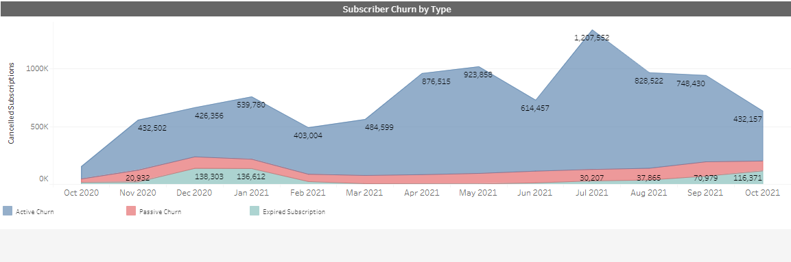
- Subscriber Churn by Type - This column chart provides more information as to
why Subscriptions were lost (as displayed in the Subscription Acquisition
vs. Subscription Loss (churn) chart above). It divides the monthly
subscription loss to:
- Active churn - The subscriber actively engaged and opted out of the subscription. Displayed in blue.
- Passive churn - subscriptions were stopped due to billing and payment failures. Subscriber did not opt out. Displayed in red.
- Expired subscriptions- subscriptions limited to a specific period, after which they expired.Displayed in light green.
Directions:
- Hover over any area of the chart to see a pop-up data box with the relevant subscription loss (churn) numbers detailed
- Click a certain shaded area to exclude the other sections and focus on one type of churn. For example, click on the red area to see only the Passive churn data.
- Subscription Acquisition vs Churn by Product - This column chart is split by
month and displays information on how many new subscriptions and cancellations occur
each month for the selected products over the last 12 months. This column chart can
be filtered by Product (SKU).
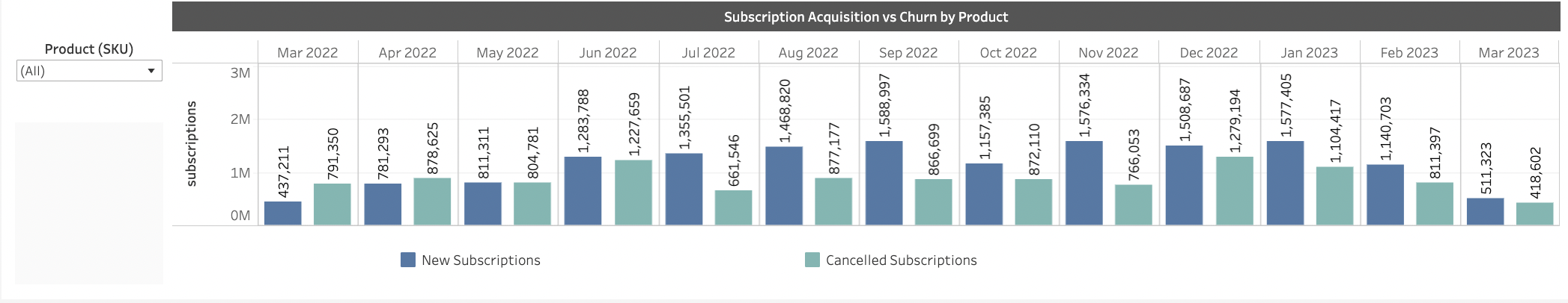 Note: In some instances, the new and cancelled subscription numbers displayed in the Subscription Acquisition vs. Churn By Product column chart can be higher because a subscription has more than one product or they have changed the product during the month. We are also counting the product even if it is active for one day in a month.
Directions:
- In the Product (SKU) dropdown list, select which specific products appear or leave All selected.