Master Dashboard Portal
The Master Portal tab provides the high-level view of your business performance and let's you drill-down for more data in each of the relevant areas. It includes:
- Metrics:
- MRR - Monthly Recurring Revenue - the calculation standardizes the captured revenue of the different subscription plans over the last 12 months.
- ARPU - Average Revenue per user - provides a standardized "user value" by calculating the total captured revenue divided by subscriptions over time.
- Account Count - The number of customers. This metric displays the entire customer list count over the merchant's lifetime.
- Active Subscription Count - The number of currently active (and pending activation) subscriptions.
- Revenue Last 12 Month - The merchant's total captured revenue in US Dollars (converted from the captured currency by a daily conversion rate).
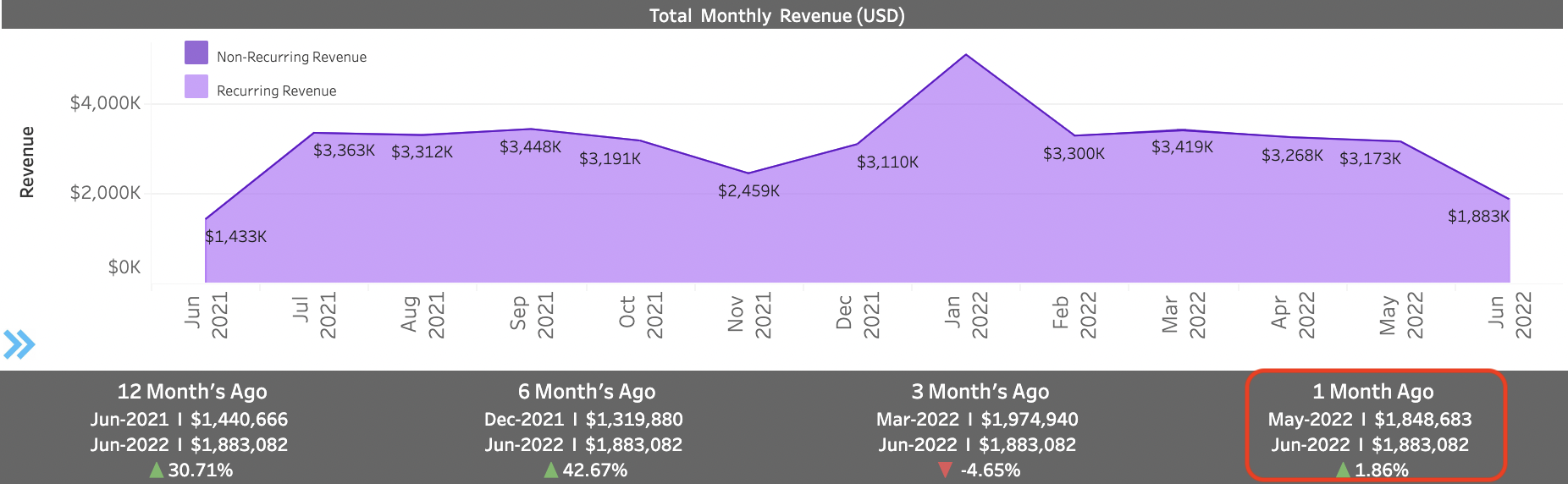
- Total Monthly Revenue - The chart displays the total revenue per month for the last 12
months. Data is divided into recurring revenue (captured by
subscriptions) displayed in dark purple and non-recurring revenue
(captured by one-time purchases) displayed in light purple.
Directions:
- Hover over any month in the graph to see a pop-up data box with the month's revenue details.
- Numbers at the top of the plot line show the Total Captured Revenue per month (this is the sum total of recurring and non recurring revenue)..
- Current month displays data up to date 3 days ago. Often this displays partial month revenue and so data may be lower than expected.
- Bottom trend bar displays variance trends when comparing
current month to date data with previous months' (for same
period) data.
For Example, if the data presented is updated until 06/10/2022 (June 10th). The trend from 1 month ago would compare total revenue from May 1-10 vs. current month revenue June 1-10. The difference between the two is shown. So this month to date revenue was higher by $34,399 than previous month revenue for the same period. This is a 1.86% rise in revenue.
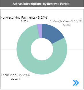
- Active
Subscriptions by Renewal Periods
- A pie chart
displaying the breakdown of all active subscriptions, percentage and
numbers (this is a breakdown of the total amount shown in the Active
Subscription Count tile above), split by their billing frequency (in
other words, the billing plan frequency) such as monthly plans, or
yearly plans.
Directions:
- Hover over any section of the chart to see a pop-up data box presenting the specific renewal period details.
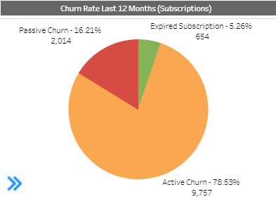
- Subscription Churn Rate (in the last 12 months) - A pie chart
displaying a breakdown of subscription loss in the last 12 months by
- Active churn - The subscriber actively opted out of the subscription.
- Passive churn - subscriptions were stopped due to billing and payment failures. Subscriber did not opt out.
- Expired subscriptions- subscriptions limited to a specific period, after which they expired.
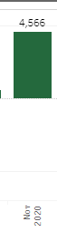
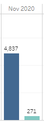
- Monthly Subscription Variance - This column chart shows the
overall monthly subscription number trend (increasing or decreasing)
when considering new subscription acquisition (sign-ups) vs. lost
subscriptions (churn).
- A green positive column shows that overall in the specific month there were more subscription sign-ups than cancellations.
- A red negative column shows that overall in the specific month there were more lost subscriptions (cancellations) than sign-ups.
For example, a green column showing 4,566 for a month means that the merchant overall had 4,566 more new subscriptions. When looking at a more detailed look, this could mean that in that month 4,837 new subscriptions were acquired and 271 subscriptions were lost (to passive, active or expiry churn).
Note: This column chart serves as a summary displaying the monthly trend. For detailed monthly numbers of new subscription and cancelled subscriptions, drill-down to the Retention Insights tab and see the Subscription Acquisition vs. Churn chart.